The swift convergence of food and music culture meets on the restaurant pop-up promo poster.
Back in 2013, an artist friend made a show poster for my old band Krill that depicted me and my two bandmates as poached eggs, floating in a pot of chunky tomato sauce. It was passed around on Facebook and printed to sell at the show alongside T-shirts and vinyl LPs. Looking at it today, the yellow background and playful illustration—one yolk is singing, another has a beard—catch the eye, while text communicates the necessary info. Bright yet decipherable with a bit of levity, it’s a typical indie show poster. But if I saw it on my feed now, I’d assume it was for a restaurant pop-up.
As someone with a background in both music and food, I’ve noticed the aesthetic language around concerts and pop-ups edging closer and closer together as social media has crystallized into an all-important promotional tool for both communities. While live music has a storied history of poster art that can trace its roots to the psychedelic ’60s (in particular shows promoted by Bill Graham at San Francisco’s venerable venue the Fillmore), the food world hasn’t always had the same relationship to the art form.
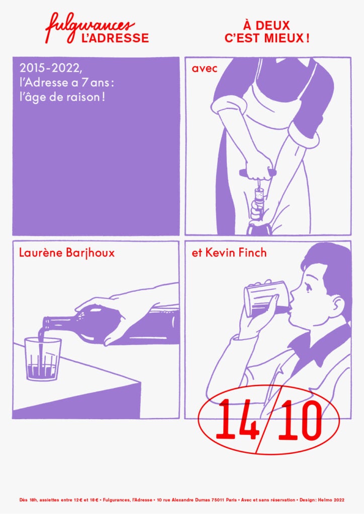
DIY shows don’t often feel like guest-chef dinners, but as the inverse becomes increasingly true, like-minded chefs and designers are taking inspiration from alternative music, fine art, and one another to create a new visual vocabulary for a rapidly changing food culture.
“You have this thing now that didn’t really exist a long time ago, where chefs aren’t in their restaurant—they’re on the road,” says Nils Bernstein, food editor at Wine Enthusiast and an alum of legendary indie record labels Sub Pop and Matador. “They’re essentially ‘playing’ small venues for one night, and then going to another venue for one night—they’re on tour!”
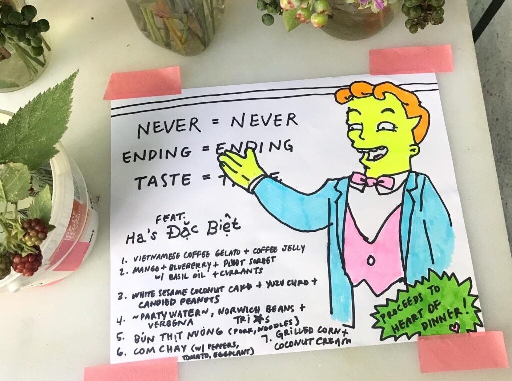
Indeed, this very language shows up on food world posters now too—from a sneakily corporate Momofuku Noodle Bar “on tour” poster (presented by Amex Gold Card) to the more indie Ha’s Đặc Biệt summer 2024 North American Tour, featuring clever art by the New-York-based pop-up’s friend, the artist and musician Ano Chrispin. “My first instinct is to emulate tour flyers,” Chrispin tells me. While he is a classically trained painter, he’s a self-taught graphic designer. “I look at various color palettes from album covers and slips and vinyl sleeves that I love,” he adds.

Natasha Pickowicz x Ha’s Đặc Biệt
Chrispin is not the only designer to code-switch between the worlds of music and food. “Record sleeves were one of the things that got me into [graphic design] in the first place,” says Rusty O’Shacklewell, the pseudonymous London-based graphic designer who makes posters for restaurants like BRAT and Kiln through his studio Personality Crisis. Long before he ever made a pop-up poster, he was doing graphics for shows around London in the early 2000s. “I cut my teeth in that world,” he tells me. “I did stuff for mates who were DJs or in bands.”
At the time, he was working at a music promotions company alongside Ben Chapman, who went on to found London’s Super 8 restaurant group in 2014. Naturally, O’Shacklewell was tapped to create posters when Chapman’s restaurants started putting on events, and the directive was simple: “I remember him saying to me: ‘I’m just gonna promote the chef like it’s a gig’—and that’s kind of what we did!”
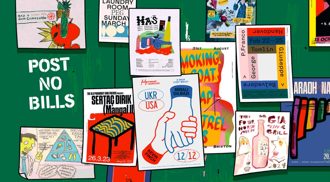
Around the same time, designer Tegan Ella Hendel moved to London from her native Australia and began making posters for the beloved wine shop and bar P. Franco—a pioneer for its embrace of guest chef culture and its ambitious food conjured from two induction burners. “It was like, ‘We wanna throw a party, how do we get people to come?’” she remembers. Hendel didn’t have a background in music specifically, but she had worked as a graphic designer at the Australian youth subculture magazine Monster Children, which covers surf, skate, film, and music. Creating event posters for a restaurant may have been somewhat novel, but it felt like second nature. “If you’ve been working in an industry where that kind of crossover is really normal, you don’t think twice,” she says.
Where O’Shacklewell’s work is more textured, with layers of scanned, collaged, and otherwise manipulated forms, Hendel’s is minimalist and type-focused, yet similarly colorful. Her designs became nothing short of iconic in London; they were printed and displayed at the bar to promote upcoming events and later framed and hung salon-style, covering one of P. Franco’s walls. Before long, fans of the restaurant were asking to buy them, so Hendel began offering an annual sale of her favorites.


